


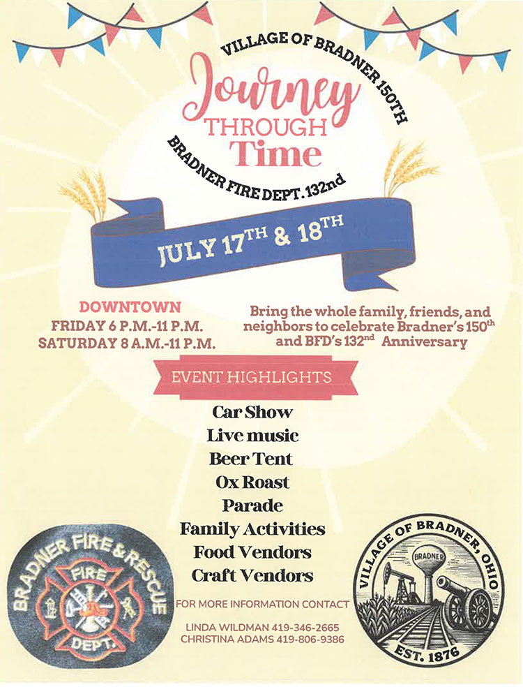
Village of Bradner’s 150th Anniversary & The Bradner Fire Department’s 132th Anniversary
July 17th & 18th
Downtown Bradner
Friday 6 p.m.-11 p.m.
Saturday 8 a.m.-11 p.m.
Bring the whole family, friends, and neighbors to celebrate!
Events include: Carshow, Live Music, Beer Tent, Oxroast, Parade, Family Activities, Food Vendors, Craft Vendors and more!
For More Information Contact:
Linda Wildman 419-346-2665
Christina Adams 419-806-9386
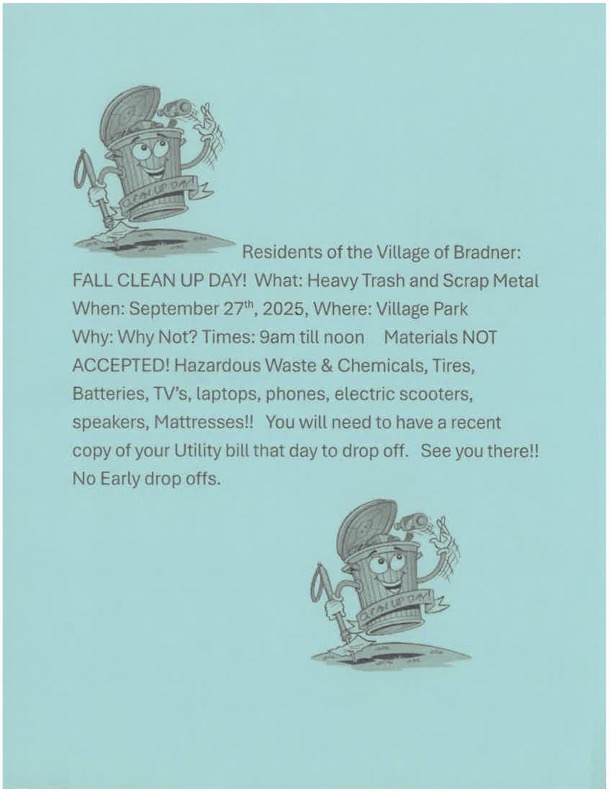
FALL CLEAN UP DAY!
What: Heavy Trash and Scrap Metal
When: September 27h1, 2025, Where: Village Park
Why: Why Not?
Times: 9am till noon
Materials NOT ACCEPTED! Hazardous Waste & Chemicals, Tires, Batteries, TV’s, laptops, phones, electric scooters, speakers, Mattresses!! You will need to have a recent copy of your Utility bill that day to drop off.
See you there!!
No Early drop offs.